branding, ui/ux design, marketing design
March for Babies
overview
What began with President Franklin D. Roosevelt's personal struggle with polio led to the creation of the National Foundation for Infantile Paralysis, better known as March of Dimes.
About half a million babies are born premature or with birth defects in the U.S. each year. Through its nationwide fundraising event, March for Babies, as well as other initiatives, this nonprofit organization has helped millions of babies survive and thrive, supporting moms throughout their pregnancy.
My role
I served as the Associate Design Director for the in-house creative team at the March of Dimes. Managing designers and freelancers, I worked with the Creative Director to ensure brand consistency across all marketing collateral including PSAs, billboards, ad placements, event signage and digital assets such as web banners, digital displays, mobile apps, landing pages and responsive websites for a unified experience at every touchpoint.
I worked closely with the marketing and development teams on brainstorming sessions, wireframing, prototyping, conducting usability tests and employing A/B testing strategies. We took to a human-centered design approach to improve the mobile and desktop experiences of our digital products and campaigns.
The challenge
March for Babies is the main fundraising event for the March of Dimes. In an increasingly digital world, many participants expressed frustration trying to use the website.
The logged in participant experience held potential to be a robust, engaging tool. The mobile app had very limited functionality. Visually, the UI design also looked dated.
previous design
Registration User Flow
“How do we create a unified digital experience between desktop and mobile, that will also make participants want to return and sign in?
How do we utilize our platform to give participants a suite of tools for fundraising and rewards for raising money and awareness? ”
Maximize the potential
Goals
Refresh the March for Babies brand styling to a look that is young, fresh and empowering
Revamp the website with a mobile-first strategy so that participants can access their accounts on-the-go as a fundraising tool
Make it easy for participants to share about the event on social media to ask for support and donations
Make the dashboard simple to use and visually engaging. Push reminders and fundraising as top-level reminders, rewarding users
for each completed task.Utilize gamification techniques to encourage active fundraising and friendly “competition”
Solution
Create a responsive, adaptive site that is mobile friendly
Keep existing downloadable app as an additional tool for tracking and asking for donations
website flowchart
Redesign of homepage
The homepage was designed in a way that broke out to 3 main buckets. Above the fold we focused on event imagery for context, focusing on the event experience with clear CTAs. Right below the fold, was a more in-depth look at the mission and the WHYs of this event. Finally, we reinforced the message with storytelling through video and personal testimonials.
Navigation redesign
A challenge I faced was how to design a 3-tier navigation system. March for Babies includes a persistent (global) navigation and two signed in navigational instances
for individual participants and team captains. Each navigation provides its own set of tools for effective fundraising and/or team leading.
Desktop Navigation (signed in users)
Desktop navigation showing 3 use cases for a Team Leader
Mobile navigation
Screen space is a precious commodity and the hamburger menu is a nice way of hiding all the important content but making it super accessible. The challenge for mobile design, was how to show the user’s account pages and multiple navigation menus in a way that felt simple and intuitive.
Three tiers of navigation
Site’s primary/global navigation
Individual fundraiser’s navigation
Team captain and/or CSO’s navigation
solution
The use of color and accordion menus to drill down the layers of the navigation
The navigation within the purple tones to represent the global menu
The navigation in the darker/gray tones to show the signed in participant experience
Tapping on the expand symbols will guide the user further into the navigation system, opening up the accordion to reveal more content
Card-based interface
The dashboard is the home base for the signed in user. It takes all the data and puts it in one easy-to-access place. The March for Babies dashboard monitored fundraising progress, event information, comparative data between teams, tasks to complete and gave access to rewards for the participant.
I designed the dashboard as a card-based interface organizing details and calls to action into chunks of information to make it easy to scan,
with top priority cards at top of the page. It was also designed for the potential of future customization features.
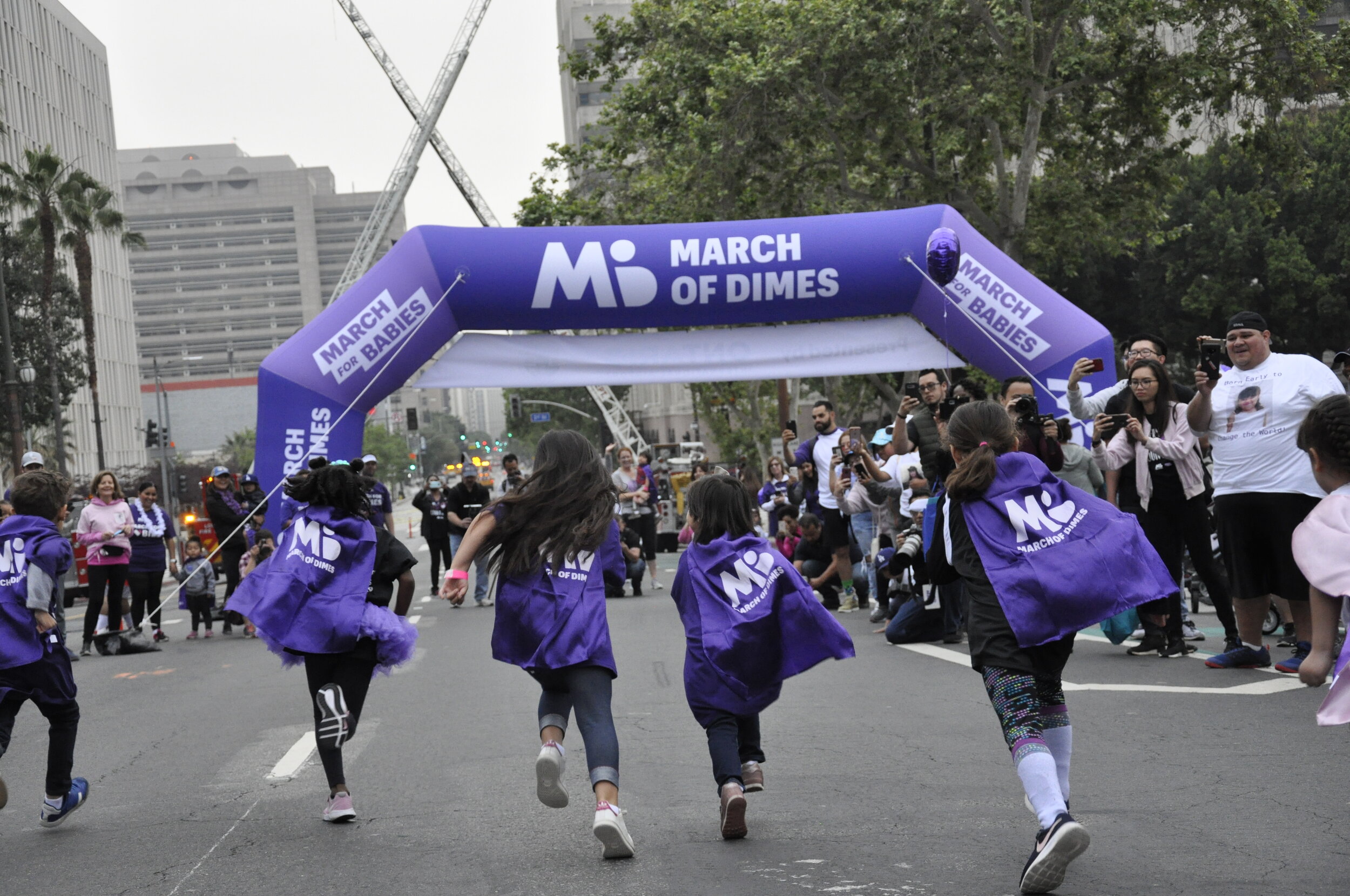
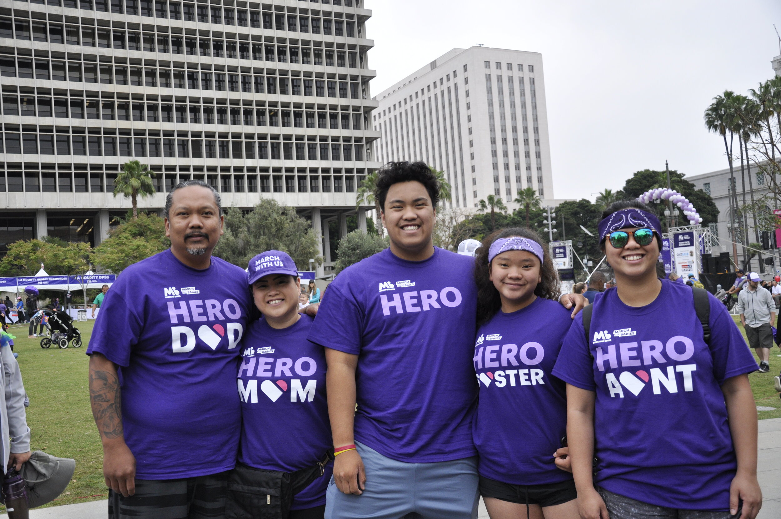
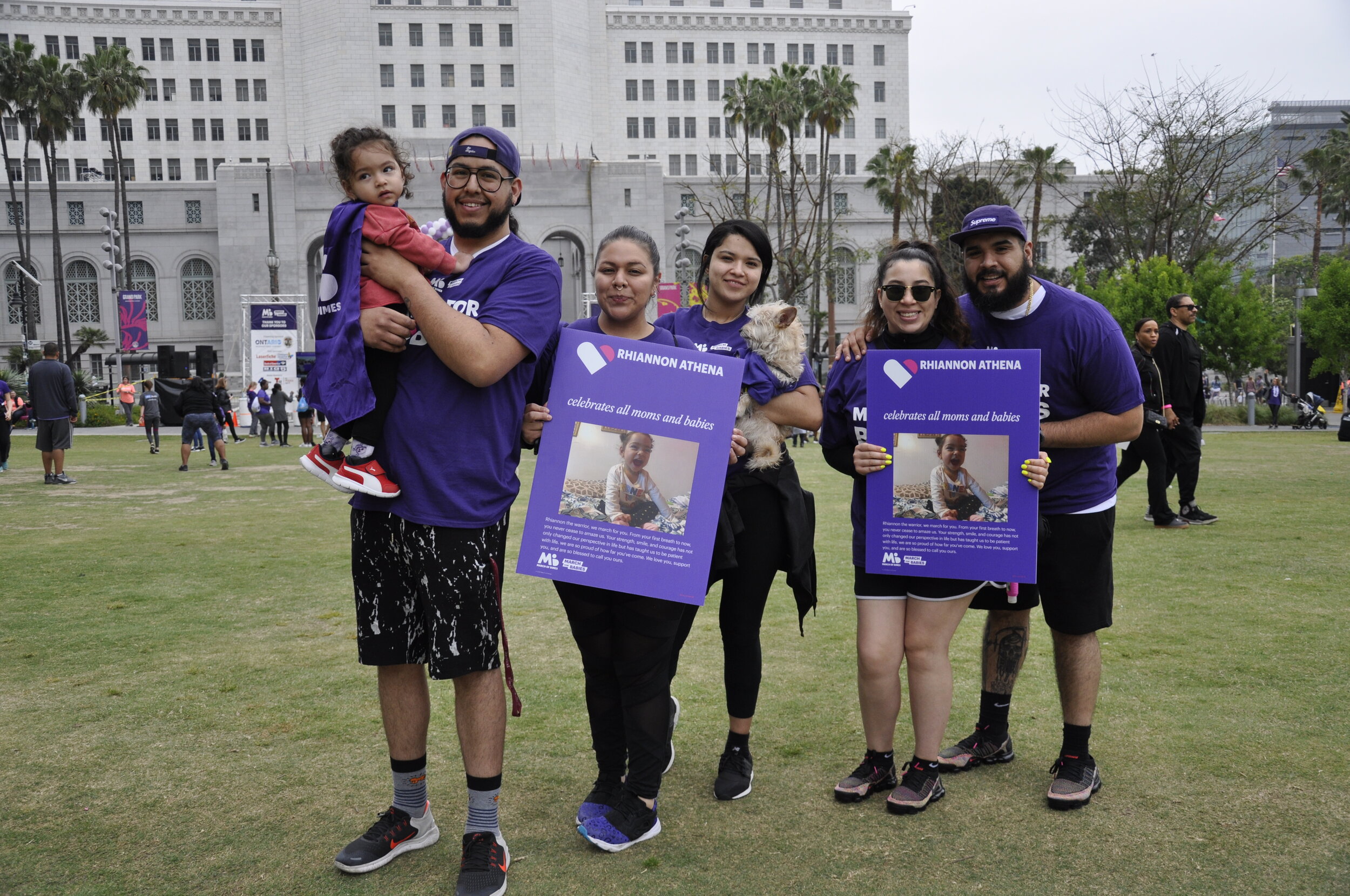
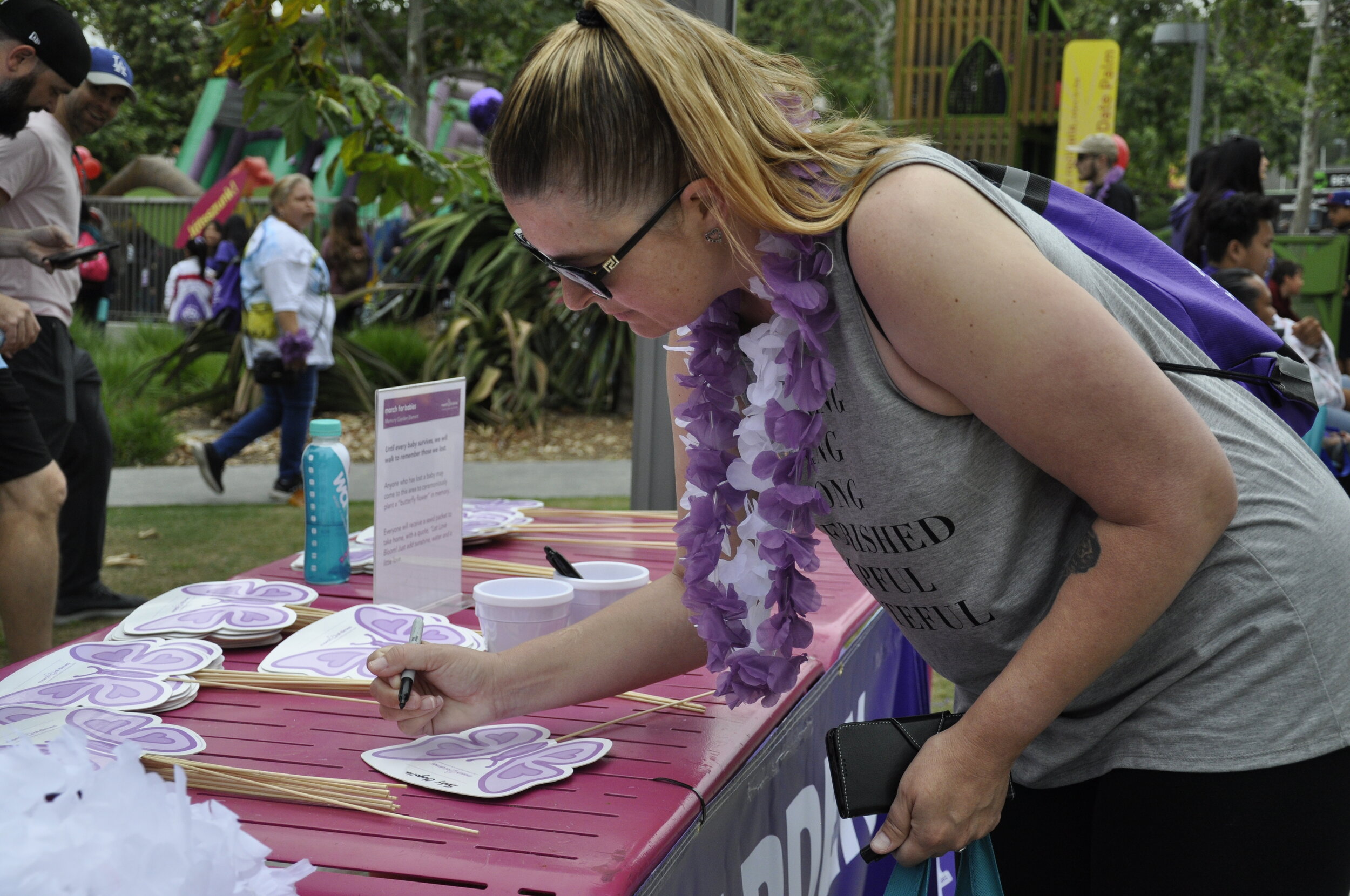
Event experience
Leading up to the event, attention was paid to every touchpoint we had with returning and potential participants. Through digital marketing, social media, PSAs,
billboards, partnerships, in-store signage, print and digital media, we sought to carry a unified voice and brand across all campaign efforts.
Event signage and banner designs
